- Writing task 1 questions
- Latest IELTS questions from May 2025
Latest IELTS questions from Australia – May 2025 (Academic Module)
Writing test
Writing task 1 (a report)
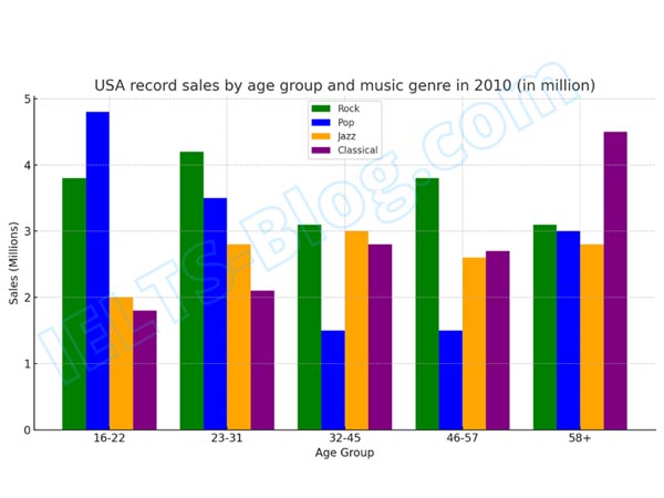
The bar chart below shows the types of music sold in the USA in 2010, by age group.
Summarise the information by selecting and reporting the main features, and make comparisons where relevant.
comparisons where relevant
New IELTS questions from Oman – May 2025 (Academic Module)
Writing test
Writing task 1 (a report)
The chart below provides information about the growth of urban population in certain parts of the world including future prediction.
Summarise the information by selecting and reporting the main features, and make comparisons where relevant.

New IELTS questions from Canada – May 2025 (Academic Module)
Writing test
Writing task 1 (a report)
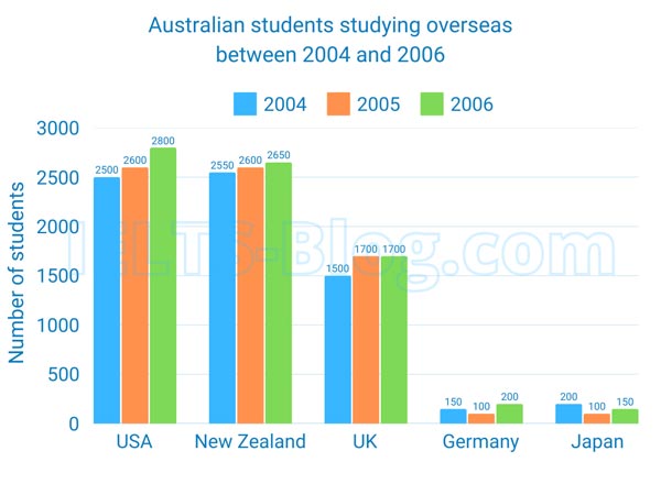
The bar chart below provides information about the numbers of Australian students who studied in five different countries between 2004 and 2006.
Summarise the information by selecting and reporting the main features, and make comparisons where relevant.
New IELTS questions from Japan – May 2025 (Academic Module)
Writing test
Writing task 1 (a report)
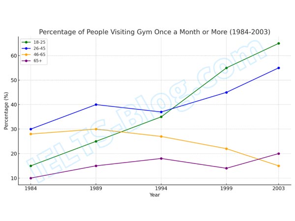
The graph below shows the percentages of people visiting gym once a month or more between 1984 and 2003 by age group.
Summarise the information by selecting and reporting the main features, and make comparisons where relevant.
New IELTS questions from the UAE – May 2025 (Academic Module)
Writing test
Writing task 1 (a report)
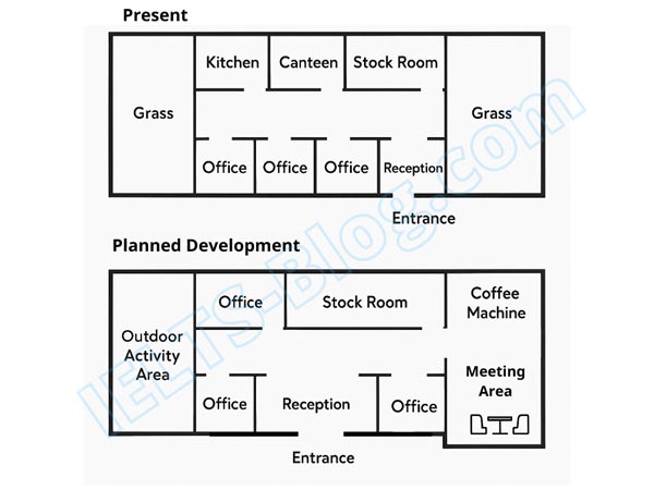
The diagrams below show how an office building looks at present and the plan for its future development.
Summarise the information by selecting and reporting the main features, and make comparisons where relevant.
New IELTS questions from the UK – May 2025 (Academic Module)
Writing test
Writing task 1 (a report)
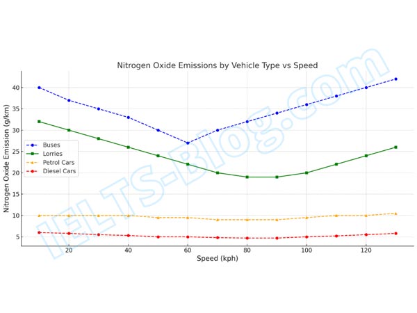
The graph below describes how vehicle type and speed affect the level of nitrogen oxide emissions.
Summarise the information by selecting and reporting the main features, and make comparisons where relevant.
New IELTS questions from Italy – May 2025 (Academic Module)
Writing test
Writing task 1 (a report)
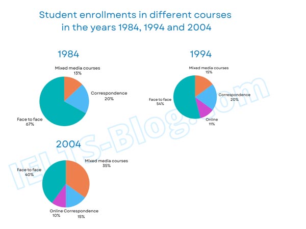
The pie charts below show student enrolments in different courses in 1984, 1994 and 2004.
Summarise the information by selecting and reporting the main features, and make comparisons where relevant.
- Latest IELTS questions from April 2025
New IELTS questions from Canada – April 2025 (Academic Module)
Writing test
Writing task 1 (a report)
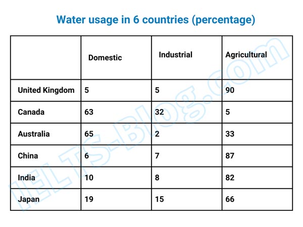
The table below describes the percentages of water used for 3 different purposes in 6 countries in 2005.
Summarise the information by selecting and reporting the main features, and make comparisons where relevant.

Latest IELTS questions from Oman – April 2025 (Academic Module)
Writing test
Writing task 1 (a report)
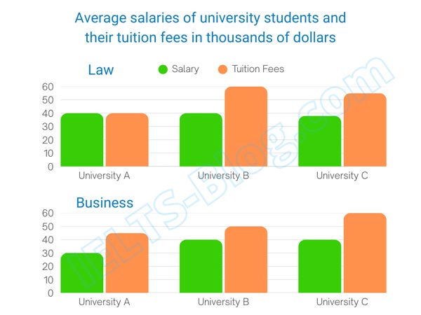
The bar charts below provide information about the salaries and tuition fees of Law and Business students from three Australian universities.
Summarise the information by selecting and reporting the main features, and make comparisons where relevant.
Latest IELTS questions from Canada – April 2025 (Academic Module)
Writing test
Writing task 1 (a report)
The bar charts below provide information about the salaries and tuition fees of Law and Business students from three Australian universities.
Summarise the information by selecting and reporting the main features, and make comparisons where relevant.
Latest IELTS questions from the UAE – April 2025 (Academic Module)
Writing test
Writing task 1 (a report)
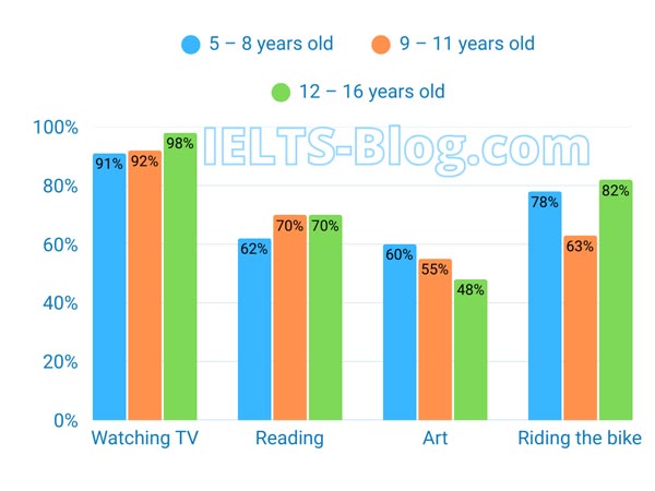
The bar chart below shows percentages of three groups of Australian children taking part in four kinds of activities in 2012.
Summarise the information by selecting and reporting the main features, and make comparisons where relevant.
- Latest IELTS questions from March 2025
Latest IELTS questions from Oman and Uzbekistan – March 2025 (Academic Module)
Writing test
Writing task 1 (a report)
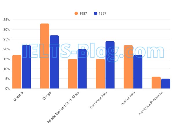
The chart below shows the percentage of migrants to Australia from six different regions in 1987 and 1997.
Summarise the information by selecting and reporting the main features, and make comparisons where relevant.
Latest IELTS questions from Japan – March 2025 (Academic Module)
Writing test
Writing task 1 (a report)
The line graph below shows the average high and low temperatures in Glasgow, Scotland, over the course of a year, while the table provides information on the average monthly rainfall and sunshine hours.
Summarise the information by selecting and reporting the main features, and make comparisons where relevant.

Latest IELTS questions from Canada – March 2025 (Academic Module)
Writing test
Writing task 1 (a report)
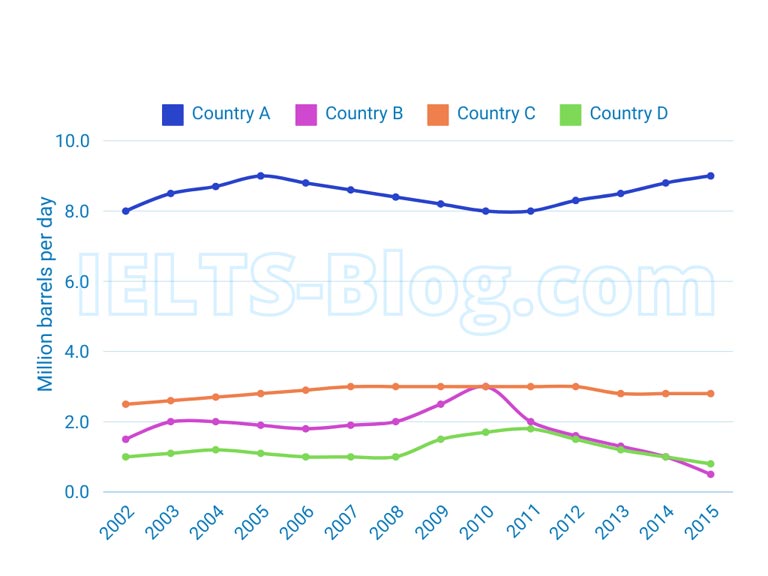
The graph below describes oil consumption of 4 countries from 2002 to 2015, in million barrels per day.
Summarise the information by selecting and reporting the main features, and make comparisons where relevant.
- Latest IELTS questions from February 2025
Latest IELTS questions from Dubai, UAE – February 2025 (Academic Module)
Writing test
Writing task 1 (a report)
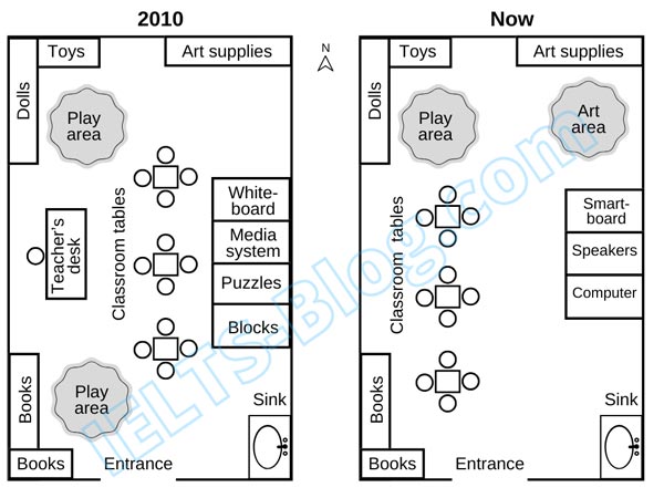
The diagrams below show the layout of a preschool classroom in 2010 and now.
Summarise the information by selecting and reporting the main features, and make comparisons where relevant.
Latest IELTS questions from the UK – February 2025 (Academic Module)
Writing test
Writing task 1 (a report)
The charts below illustrate the percentage of time that male and female students spend on five different types of websites.
Summarise the information by selecting and reporting the main features, and make comparisons where relevant.

Latest IELTS questions from the UAE – February 2025 (Academic Module)
Writing test
Writing task 1 (a report)
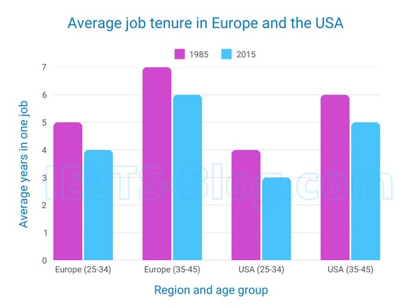
The bar chart shows the average duration individuals aged 25-34 and 35-45 remained in a single job in Europe and the USA in 1985 and 2015.
Summarise the information by selecting and reporting the main features, and make comparisons where relevant.
- Latest IELTS questions from January 2025
Latest IELTS questions from Saudi Arabia – January 2025 (Academic Module)
Writing test
Writing task 1 (a report)
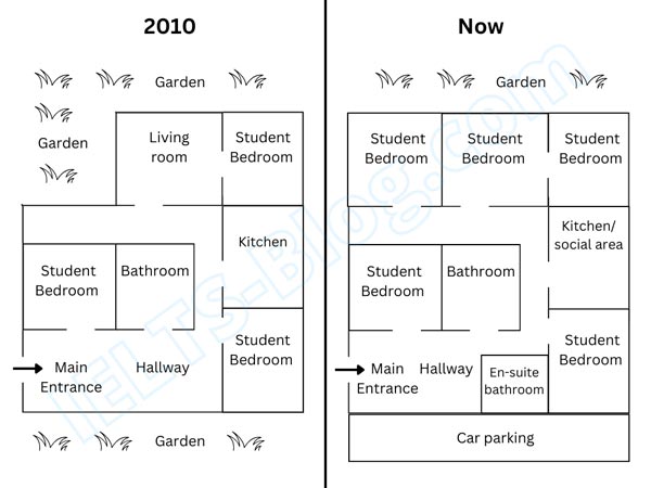
The two plans below show student accommodation in 2010 and now.
Summarise the information by selecting and reporting the main features, and make comparisons where relevant.
Latest IELTS questions from Australia – January 2025 (Academic Module)
Writing test
Writing task 1 (a report)
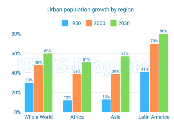
The chart below provides information about the growth of urban population in certain parts of the world including future prediction.
Summarise the information by selecting and reporting the main features, and make comparisons where relevant.
Latest IELTS questions from Singapore – January 2025 (Academic Module)
Writing test
Writing task 1 (a report)
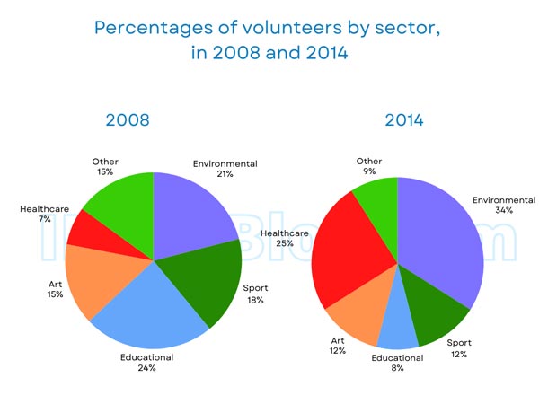
The charts below provide information about the percentages of volunteers in different sectors in 2008 and 2014.
Summarise the information by selecting and reporting the main features, and make comparisons where relevant.
Latest IELTS questions from India and Pakistan – January 2025 (Academic Module)
Writing test
Writing task 1 (a report)
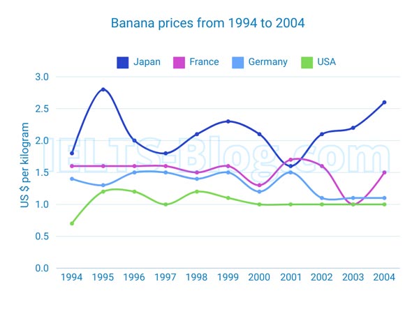
The graph below provides information about the price of bananas in four countries between 1994 and 2004.
Summarise the information by selecting and reporting the main features, and make comparisons where relevant.
